
The warp identity
The green snake and electric-blue portal introduce the game’s central idea: a classic arcade run in which spatial shortcuts can completely change the route.
Visual guide
A closer look at the game’s neon presentation, arcade systems and layouts for desktop, tablet and phone.
The green snake and electric-blue portal introduce the game’s central idea: a classic arcade run in which spatial shortcuts can completely change the route.
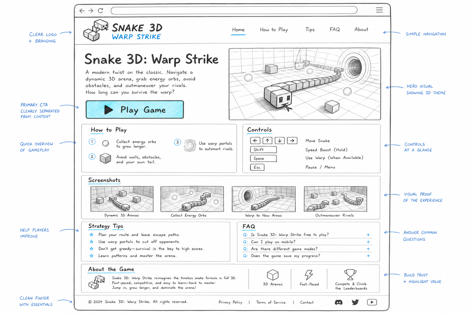
The desktop design keeps the game description, start button, controls, strategy and supporting information visible in a clear content-first layout.
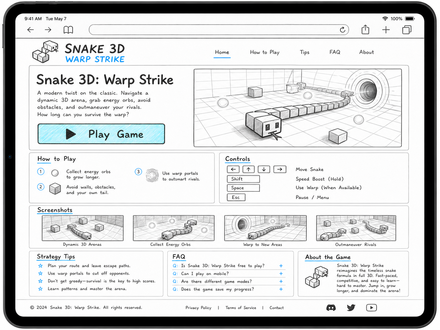
On a wide tablet, the introduction remains side by side while instruction cards resize below it. Touch targets stay large enough for fingers.
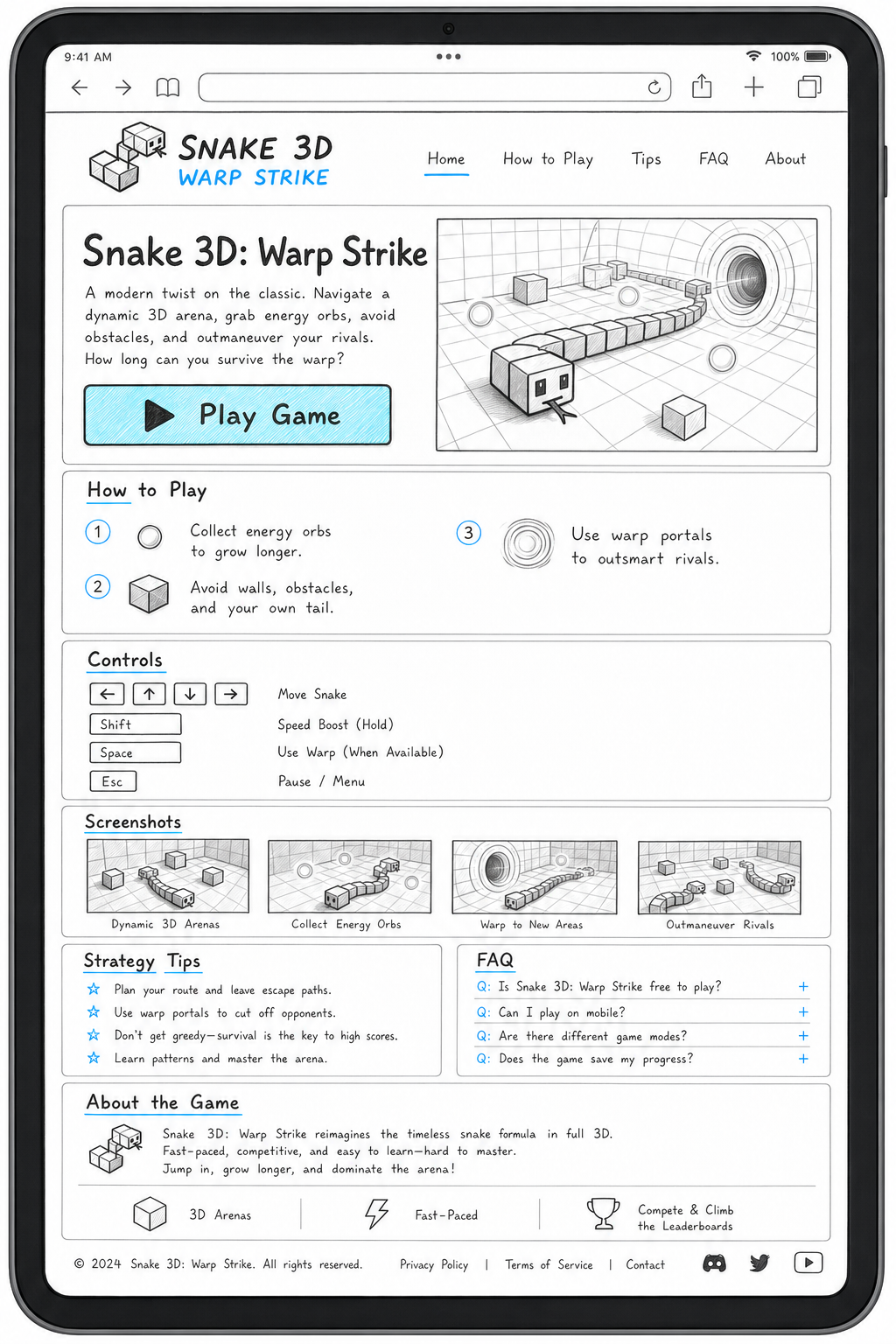
Portrait tablets stack the controls and supporting sections so the page remains readable without shrinking text or requiring sideways scrolling.
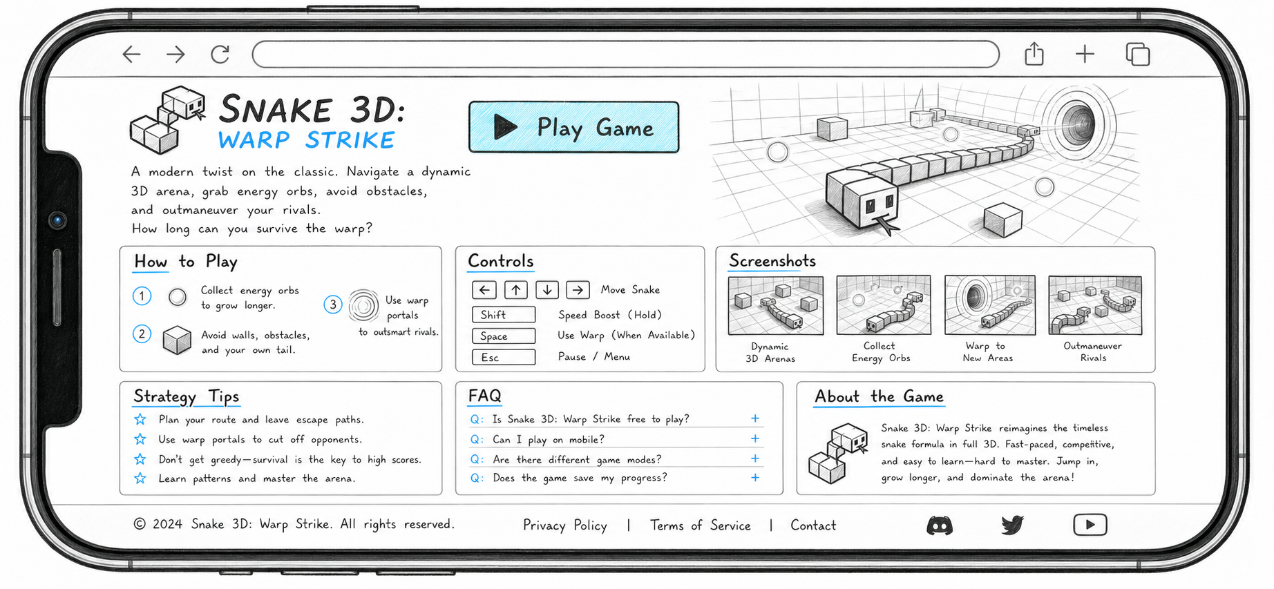
The short landscape view uses a compact header and a two-column opening area, leaving the primary Play Game action immediately available.
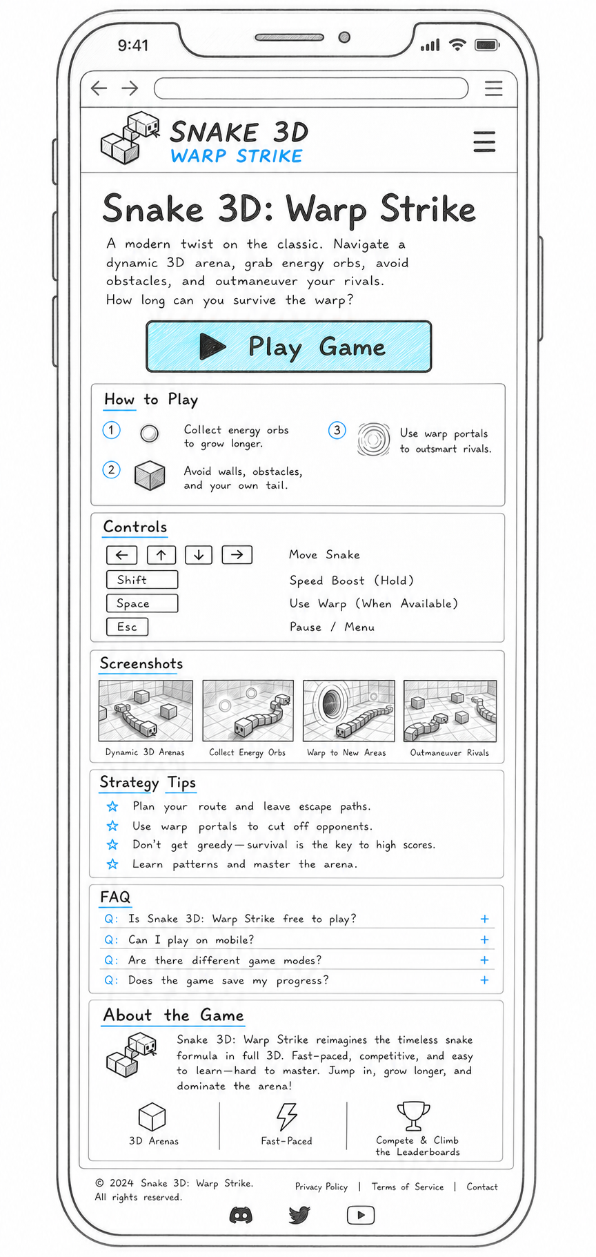
On narrow screens, the page becomes one continuous column with a menu button, full-width play control and readable instruction cards.